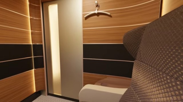
What’s the best way to design and lay out a store in the virtual world? One of my responsibilities in our virtual world is building most of the shops, so this is a topic always on my mind. In search of some fresh ideas, I recently visited the Hair Fair in Second Life. Although the hair creations showcased at the event are interesting, I am always more fascinated by the venue–the design of the sims and the individual shops.
I complain that I struggle with creativity, that I am more of an engineer than an architect. But instead of just whining about my deficits, I do my best to try to learn what I can about design, style and composition, so that I can become a better builder. For my own education, I photographed all 60 shops at the Hair Fair, and made notes about what I liked and didn’t like about each design. I was struck by how each tiny shop was uniquely and meticulously designed, and how lovely they all were.
I decided to share some of my observations here, for the benefit of my friends on Littlefield Grid. We are blessed on Littlefield Grid to have a lot of creative people, who generously share their creations with other members, so we have lots of shops. While there is nothing wrong with pasting vendor signs on the walls of a rectangular room, it can be fun to challenge yourself to think creatively, and come up with new and different ways to arrange a store. Please allow me to support you, by sharing some of my observations.
1. GET OFF THE WALL!
There is no law that says you have to paste vendor signs onto a wall. Sometimes someone will complain to me that they have used up all their wall space. While making a bigger store for them is not a problem, there are lots of other ways to use the space. Use the middle of the room!
This shop sported hotel lobby luggage carts:
Here the signs were hung from the ceiling:
Products and vendors can sit on various types of tables, shelves and racks. This also allows you to use the wall for other things, like windows, to enhance the appearance of your shop.
.
2. BREAK THE BOX!
Frank Lloyd Wright famously waged war against the tyranny of the “box.” When every room is a rectangle with corners, it gets pretty boring and can feel confining. Although the space assigned for your shop may be rectangular (as all these examples were), you can take steps to make the shape more interesting. When the corners disappear, the room feels more spacious.
These shops varied the shape of one end of the room, making it round instead of square.
Who says that the floor has to be flat? Or the walls or ceiling, for that matter?
Here they made the corners vanish into darkness.
This shop got rid of the corners… and the walls and the ceiling and the floor… leaving nothing but product.
.
3. USE A MOTIF
You can make your shop more interesting with a theme or motif that reflects your style and the style of your products. Here are a few interesting ones I saw:
Parking Garage:
Make the indoors outdoors – go to the beach:
.
4. FRAME WITH ALCOVES
If you have to use the wall, consider creating alcoves to frame your product.
Above all, make the experience of visiting your shop an interesting one for your guests. It’s a great way to make life more enjoyable in our virtual world. Your creations are and should be the center of attention. I hope this shows you some ways to make them stand out!
.


